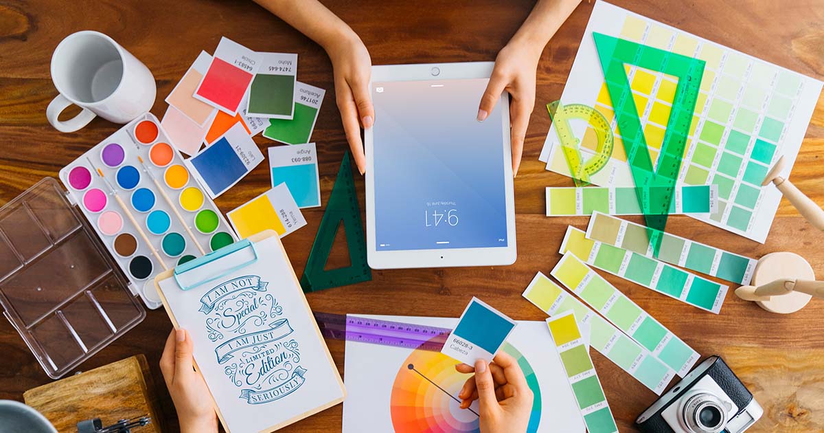
Colours are not just for aesthetics but they are a powerful communicator specially when it comes to website. The colours you select in web design have the power to affect user feelings, perceptions, and even behaviour. This enables you to build a deeper connection and a stronger relationship with your audience. You can consult with numerous web designing company in Siliguri to get a better picture on the impact of colours.
Understanding how different colours affect human psychology can impact on your business significantly. This will help you establish credibility, evoke the feelings you want, and eventually increase conversions. In this article we will be understanding about what are the psychology behind the colours and how it can affect your website performance.
Why Colour Psychology Matters in Web Design
The colour scheme of your website establishes the tone for your business, basically it creates a sense of attraction and brand identity which can influence the way customer act to your services or products. Here are some of the factors that can be influenced with brand colours.
Emotional Connection:
Colours evoke associations and feelings. Red may evoke excitement, whereas blue may suggest trust.
Brand Recognition:
Using particular colours consistently helps to establish your brand identity and increases your recall value.
User Behaviour:
Colours have the power to highlight calls to action, evoke a sense of urgency, or encourage calm.
Accessibility:
Making thoughtful colour selections also guarantees that everyone, including those with visual impairments, can visit your website.

What Colours can actually mean
Applying color psychology carefully allows you to do more than just create aesthetically pleasing websites. You can design a strong, emotionally impactful experience that engages users, fosters trust, and advances your corporate goals. Here are some of the major psychological factors of colours associated with web designing.
Build Trust and Authority
When it comes to web designing colours can not only make your website attractive and engaging but can create a sense of trust and authority. For a better understanding, Blue is often associated with trust, security, and professionalism widely used by banks and tech companies. Green conveys calmness, health, and eco-friendliness. White conveys a feeling of openness, simplicity, and clarity. Grey gives a feeling of maturity, equilibrium, and neutrality.
Evoke Emotion and Urgency
Colours have the ability to affect user behaviour and elicit feelings quickly. Call-to-action buttons and sales promotions benefit greatly from the urgency, enthusiasm, and attention that warm hues like red and orange generate. Cool colours like blue and green are ideal for service-based websites because they convey reliability, serenity, and trust. In addition to improving aesthetic appeal, carefully chosen colour schemes encourage action and foster a strong emotional bond with users.
Represent Growth and Harmony
Green is the most popular colour in web design, representing harmony, balance, and growth. Financial services, wellness sectors, and eco-friendly firms frequently utilize it to symbolize stability, rebirth, and nature. While gentle blues evoke feelings of peace and serenity, earth tones like brown and beige also encourage loyalty and trust.

Convey Luxury and Creativity
In web design, rich purple, gold, and black are commonly associated with exclusivity, elegance, and luxury. These deep hues give off an upscale, upscale vibe. However, vivid hues like violet, magenta, and teal encourage originality, imagination, and creativity. Strategic use of these hues makes brands stand out, evokes refinement, and appeals to consumers seeking something different and motivational.
Provide Purity and Clarity
Deep purple, gold, and black are commonly associated with richness, elegance, and exclusivity in web design. These deep colours have upscale vibe. However, colours such as violet, magenta, and teal encourage originality, imagination, and creativity. Strategic use of these colours makes brands stand out, evokes refinement, and appeals to consumers seeking something different and motivational.
However, you should keep in mind that maintaining a nice contrast, being consistent, and knowing your audience are essential. A professional and reliable impression is also greatly enhanced by the careful use of white space and the strategic use of accent colours. In the end, a carefully considered, condensed palette frequently works better than a busy one.

